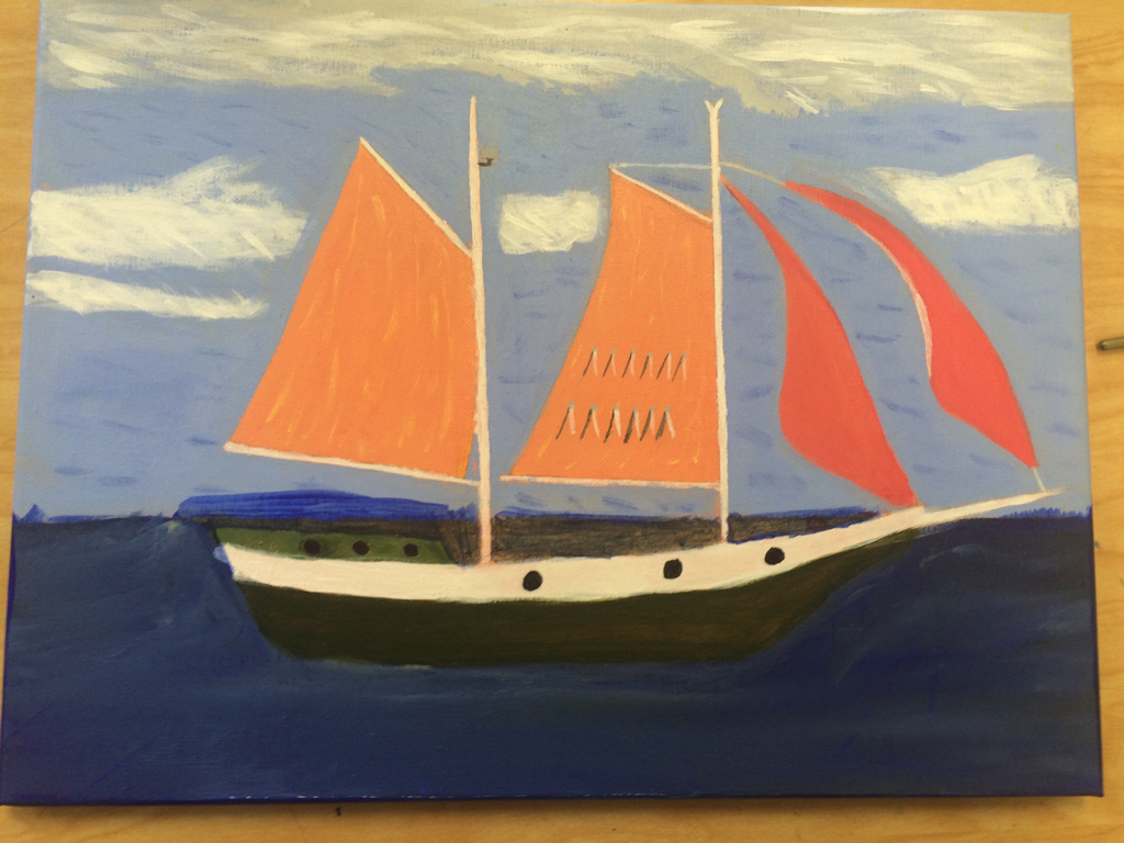
 My artist was Vincent Van Gogh, he like to do landscapes, objects, people, and things with one main focus, overall I like the painting I do feel like I could've made my lines neater but all the colors turned out how I wanted them to so that helped the painting. The most difficult part of this project was trying to make everything straight, because with paintbrushes that's hard to do, my color choices reflects my artist because he tended to use a wide variety of colors to make up one think like in the boat. Van Gogh liked painting landscapes and had paintings of boats so done I like the ocean I thought This would be ck good to do. If my artist could see this I do think he would crtize it because I think I could've done a better job of making it look like his paintings. If I could do this over again I would definitely, choose something with less little lines then a boat because that was very hard .
0 Comments
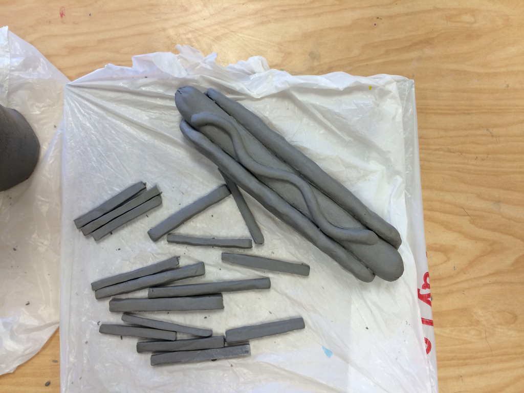 This project was pretty cool overall the neatness came out very well the colors all look very accurate to me, and I believe I did a good job choosing the right colors, the most difficult part of this project would definitely have to be the bun it didn't seem like it would be that hard but it gave me a run for my money overall with the help of my teacher it came out pretty good. 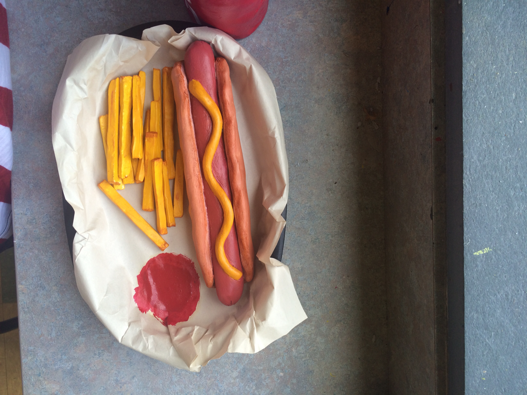 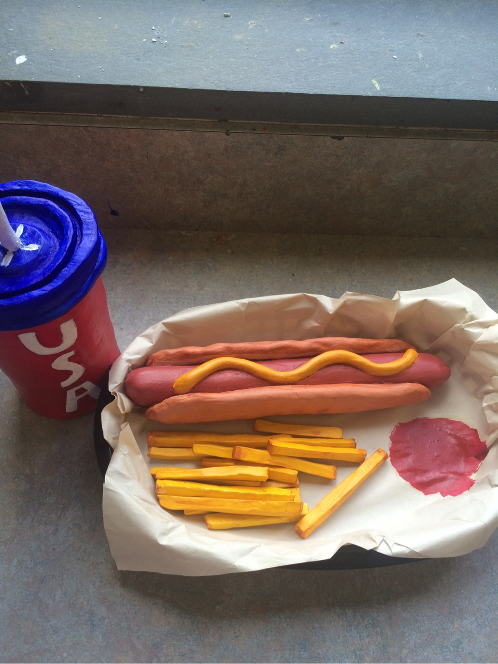 I believe the colors all go good together and the cup fits in well because when you think of Fourth of July you think of cookouts etc so the colors all go to make a theme of a Fourth of July cookout. The sculpture is cool to look at from all angles because it is in a basket, so that helps make it look real. When making something 3D instead of 2D you definitely have to make all sides look good and real to help with the illusion of 3D. to show texture in this project I used the diffrent tools and different colors to show the shading and cuts and stuff that would be on the food if it were real. I do believe my food looks real because of the diffrent shades and colors and the basket it is in which puts it over the top. If I was to do this project again I would definitely make the hot dog smaller, cause the bun was the hardest part .
My craftsmanship for this project I think is good it could have been a little neater but overall it was good, the lines are good and the colors go good together. One thing I wish I would have done diffrent was used more values to show depth I should have used lighter blue to show light sources to make it look more real, and more black close to the scales to show overlapping. I think I represented Georgia o'keeffe well because a lot of her drawings/ paintings were up close just like mine was up close to a fish, and her drawing never really had to much detail so I believe this is a good representation of her work. 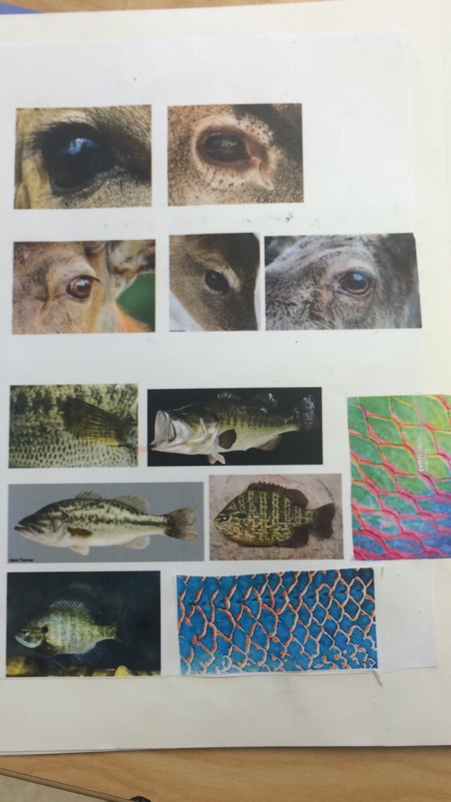 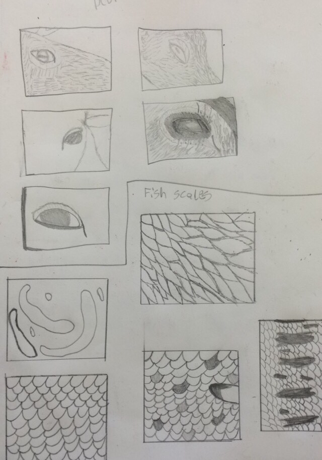 i decided to use blue and orange for the scales because I knew the complement eachother well and the were bright colors which is what I wanted, and I decided to use red for the fin to make it pop out, I used contrast to help show the diffrent scales while showing them as separate scales at the same time and to help show the overlapping, I used diffrent lines to show the texture of the scales and fin, so it would be like you could touch it, and by each scale I put black to show a little shadow to help make it look like they were overlapping. 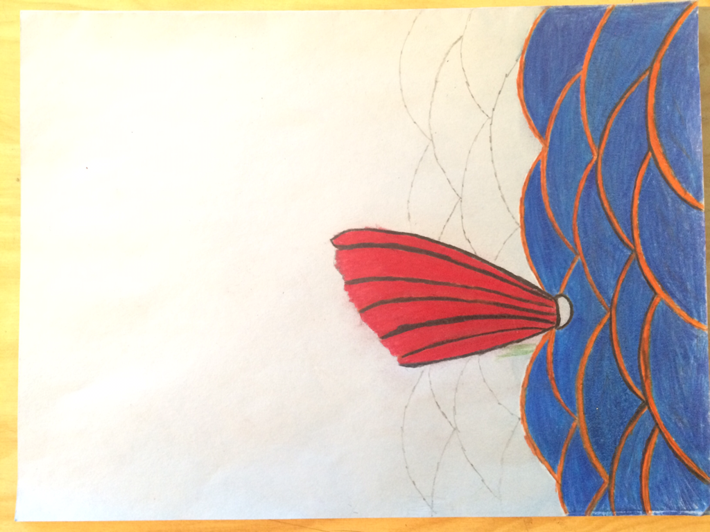 The only thing o wish I would have done more to enhance the drawing would be use more values and shadows, I shoul have put more black to help make scales more defined and should have put a shadow by the fin to make it look 3D, I also had a little trouble making the orange lines straight but overall I like the final product. 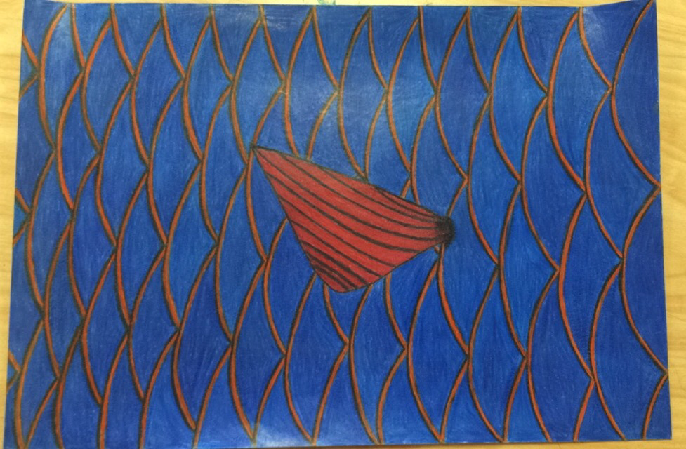 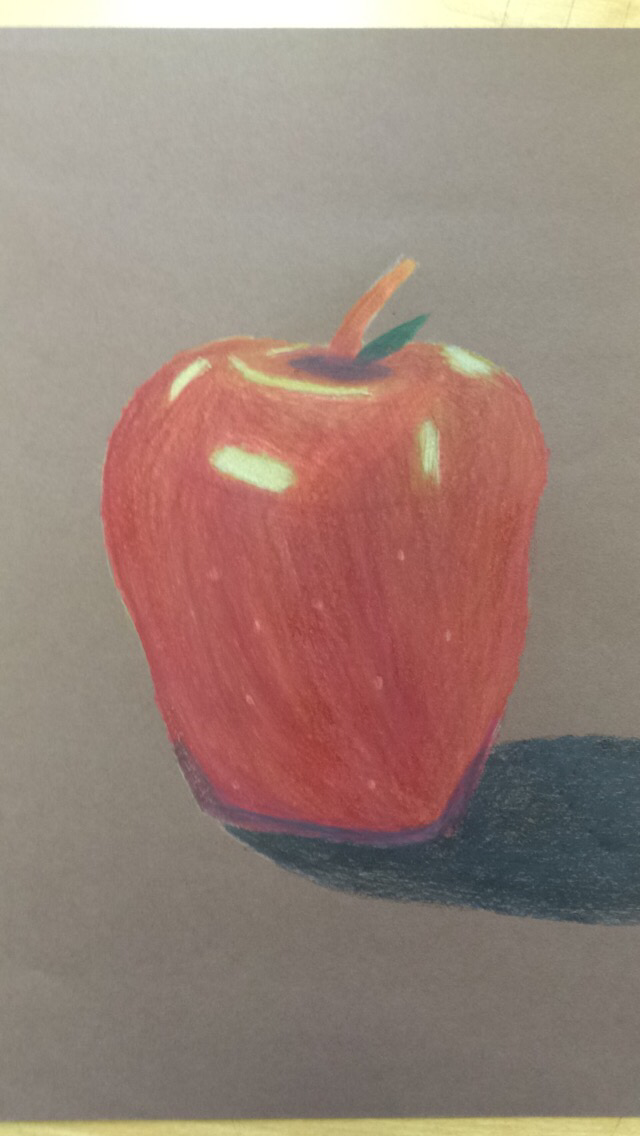 while learning to use diffrent mediums, we had to create apples to show that we know how to use the diffrent material, above is the apple I drew using colored pencils, I used diffrent colors to show the diffrent values and to help show where the light was hitting, below are the apples I made using water color, I struggled with this a little but after some more practice I got better at it like with the colored pencils we had to show the diffrent values. 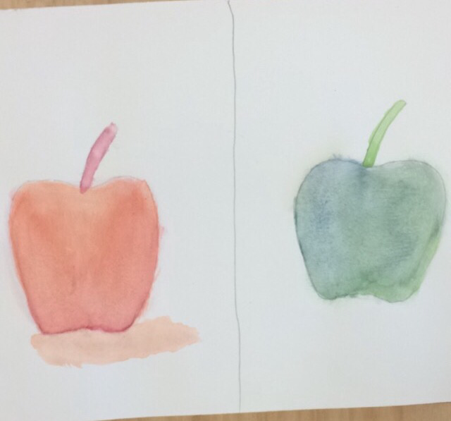 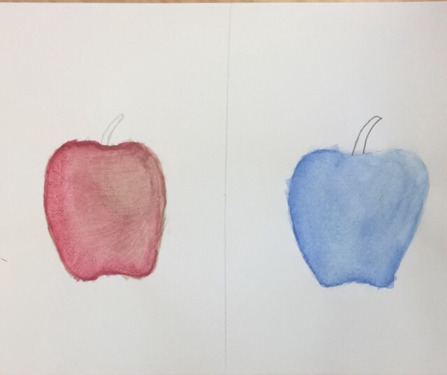 Below we had to create a soda can using oil pastels, I really liked the pastels because they are bright, it was hard to make all of the little lines, but it came out good, I used white and diffrent colors to help show the values where the light hits the can, the pastels blend well together which helps, overall I am happy with the final drawing. 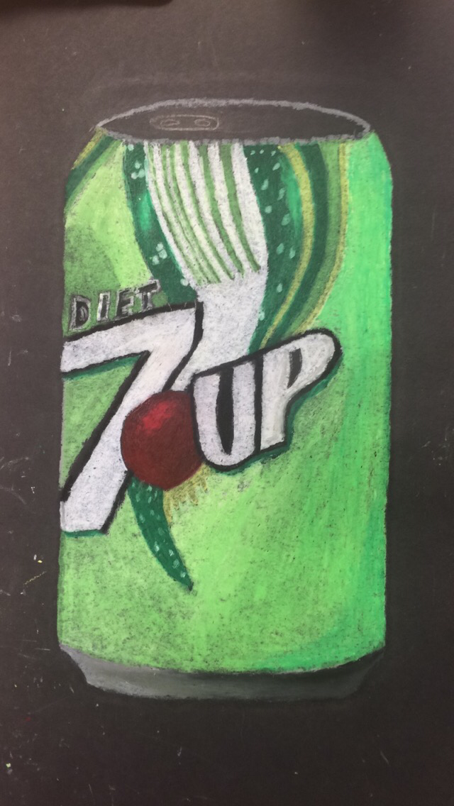 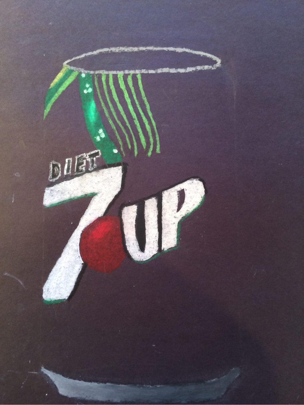  I decided to just going with basic pencil shading, I felt like that would be the best for this particular drawing. Texture is important because it gives u a feel for what the stuff actually looks and feels like which is good to have in a drawing.  Value is very important, in this project because it shows depth and that was a very important factor to this project, with out it the drawing would look flat and have no character.  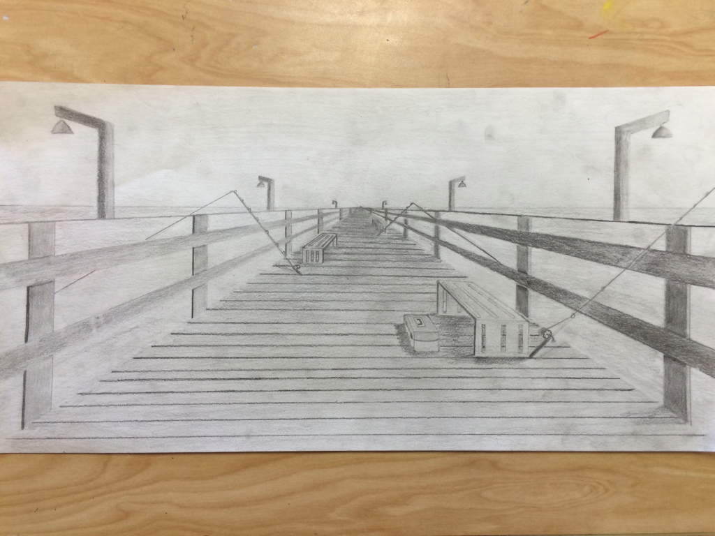 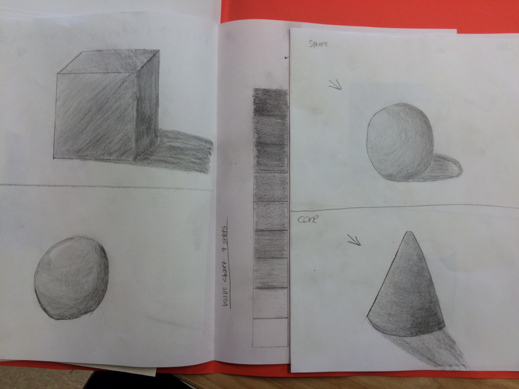 Above is some of the shapes plus value chart we had to draw and shade, for these we had to use our ability at shading to make the objects look 3D and show a light source it was good practice before the actual drawing. 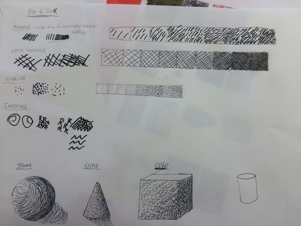 Above and below are different pen techniques we used, we used stippling , cross hatching, invented, and hatching techniques. For this we had to make value charts for each technique, then use one of them for each shape, and below is our squares we had to draw that looked like the pictures, to help us practice our pen techniques. 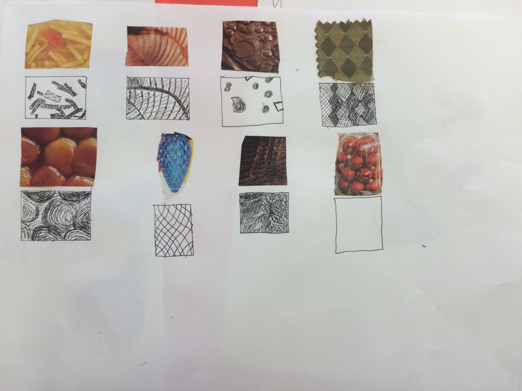 |
AuthorWrite something about yourself. No need to be fancy, just an overview. ArchivesCategories |
 RSS Feed
